Hello friends,
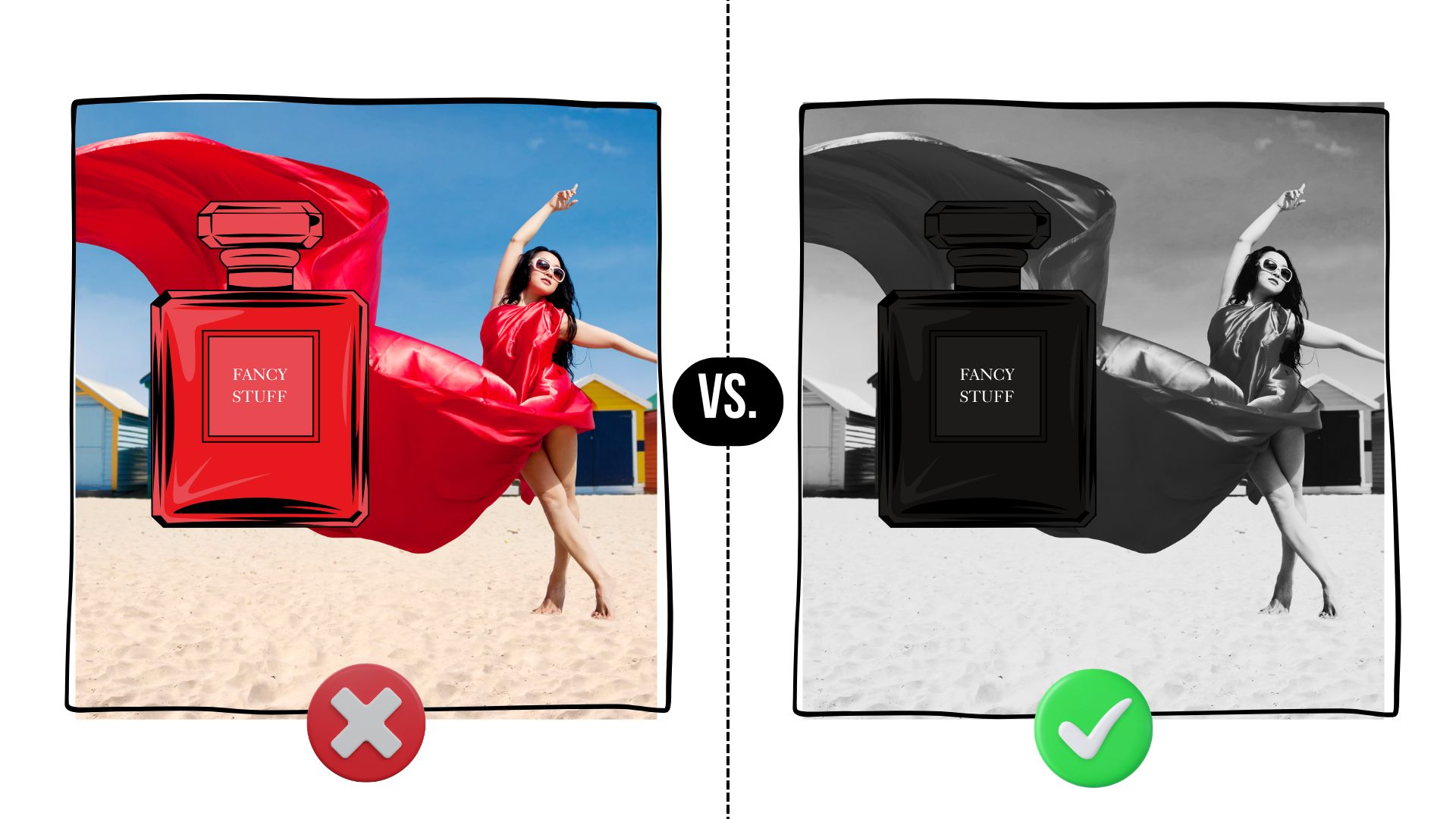
Did you know that the manipulating the saturation of your ad images can increase how luxurious your products or services feel?
The study:
People were shown the same luxury product ads (jewelry, designer watches, luxury beauty products, etc.) either in black and white or in color.
They then rated each ad on how luxurious it felt (Wang et al., 2014).
🧪What they found:
The results were consistent across categories.
Black and white ads scored the highest on luxury.

Why?
Most people see color everywhere, everyday, so our brains have learned that most things are colorful.
When you remove color from something, the brain no longer sees the object as part of the “here and now.” It feels a little separate from “normal” life.
That space creates psychological distance.
Distance makes objects feel rare.
And rare things feel more expensive.
Caveat
You might be thinking: “Well what about brands like Tiffany? The color is iconic“
That’s what I thought too.
But the researchers actually tested this as well.
They gave the imaginary brands an “iconic“ color.
Most people evaluated the “iconic color“ ads as more luxury than regular colored ads, but still less luxury than B&W ads.
I am curious though, how it would work with a real brand that we firmly associate with certain color?
So lets do a real time test.
Take a look at the ads below and think which feels more luxury to you?

Reply to this email with your vote, I’m curious to see what you guys think.
💡Takeaway
If you sell anything that should look premium, test a black and white ad.
Go make something cool,
Ksenia, the chief nerd
P.S. I found the laziest tool for creating high-performing FB ads in under 2 mins
1)choose from 4107+ proven FB & IG ad templates (based on real high-converting ads)
2) click on the template to open and edit it in Canva or Figma
That’s literally it.
(oh and this also replaced the FB ads library for me, which was a nice bonus)


